

So I've decided to paint my music/future dining room yellow. Since my floor plan is very open, I wanted a color that would go with my blue and green color scheme. I love the analagous colors blue, green, and yellow. It reminds me of summer days: blue sky, green grass, and sunshine!
Yellow, however, is a tricky color. It comes in every shade from light cream to melt-your-face-off-with-the-intensity-of-the-sun! I painted a small bathroom yellow in our old house, and I had to paint it three times to get the right color. Also, our perception of yellow changes depending on the amount and angle of natural light coming into a room, the color of light bulb you use, and what other colors you combine your shade of yellow with. Here are some beautiful examples of the variety of effects you can get with yellow.
Very traditional--classy and formal. Although, I love putting the funky zebra print rug down there to keep it from being too stuffy!

More contemporary, but still formal, with soft, barely-there yellow walls and fabrics.

Pairing the yellow with black makes it so sophisticated.

I love the golden wood against the yellow walls and light cream cabinets. Layering different shades of yellow against each other makes for a soft, cozy feel, but the black accents keep it from being too boring.

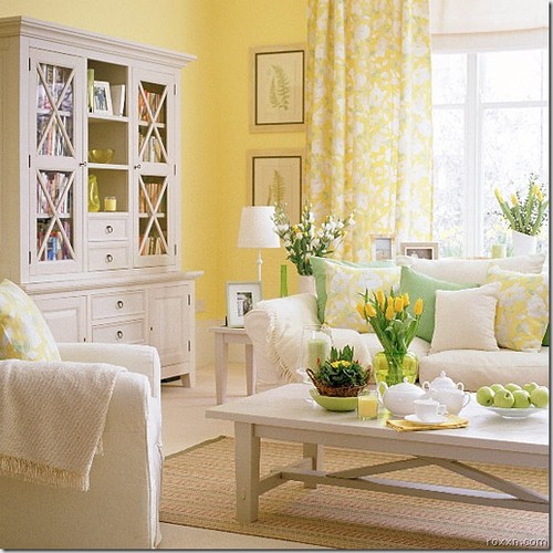
Yellow in any shade looks great when paired with white. The green accents in this room make it so fresh and natural-feeling. The only problem is, I would be deathly afraid of letting my children get anywhere near that brilliant white sofa!
Why limit girl's room colors to pink and purple? This yellow and green combination is so flirty and feminine! And don't you just adore those heart-shaped adjoining ottomans? Oh. My. Gosh. I'm a not a big fan of heart-shaped things--or pink--but for some reason, put them in these fun colors and it makes my heart melt! And did you notice that the side table there is floating? With that tray underneath you almost don't notice it!

Mmmm. Yum. How could you be grumpy in a room like this? I think it would be an instant mood lift just walking in the door. Very low contrast between these shades of yellow-green and green-yellow. It's like those Crayola crayons. Did you ever look at Blue-Violet and Violet-Blue and wonder what exactly the difference was?

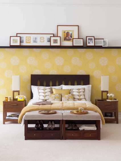
I just love the new trends in wallpaper that are big lately. The graphics are large and high-contrast, and turn your whole wall into a work of art. No subtle shade difference here--the golden yellow and pure white create a dramatic surge of color that is still not too overwhelming.

Here is the same sort of high-contrast yellow and white wallpaper, but paired up with some dark wood and soft neutral accents. These soften the contrast and make the room feel much warmer (and more conducive to sleep, I would think!)
Look how bright of a color you can get away with when you pair it with some soft neutrals. The fabric and light wood accents aren't so intense, but check out that mirror in the background! That's definitely not a color you'd want to cover an entire wall with, but with just that little pop of color against the muted colors everywhere else in the room, it totally works. Although I wouldn't choose that mirror to check my face in, because I sooo do not look good in that color!

Hi Robin-
ReplyDeleteI realize this article is old, but do you know the color/brand of the paint that is shown in the first photo of this article, the kitchen?
Thank you,
stacey :O)
ReplyDeleteStacey VicariMarch 29, 2016 at 7:17 PM
Hi Robin-
I realize this article is old, but do you know the color/brand of the paint that is shown in the first photo of this article, the kitchen?
Thank you,
stacey :O)