Calm Breeze

Thursday, February 23, 2012

Why Hot Pink is Back

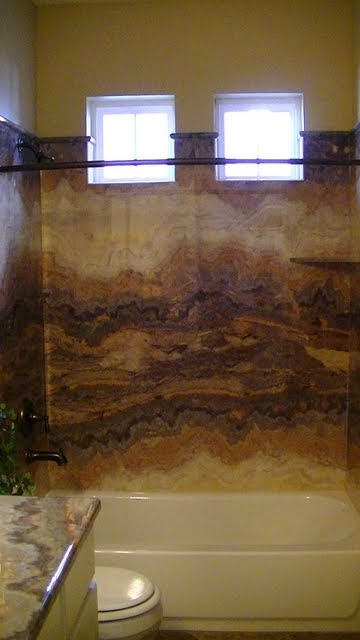
Color Trends can be used for good or evil! This is GOOD!
The other day my drafting class got out early and I took advantage of my free time without a four-year-old stuck onto my hip to sneak into Macy's for some mommy alone time. I walked in the door to be greeted with a whole center aisle display of clothing straight out of my ninth grade wardrobe. Flourescent green! Electric Orange! Hot HOT Pink! "Egads!" I thought (yes, I am the kind of person who actually thinks words like "Egads"), "Where did this come from? Did I just enter a time warp?" Being 37 and not 15, I quickly sidestepped the display and began looking for items in a more somber, serious, grown-up color scheme.

Fast forward to the next day in my Color Theory class. We were learning about color trends. If you are at all aware of the retail world, you will notice that certain colors pervade the market at any given time. I have often gone shopping for clothing and been frustrated that every single store I go to has the exact same four colors in every line of clothing, and with my luck, I look hideous in three of them. Or I will decide on a certain color scheme that I want to decorate a room in, and will be utterly unable to find any products--curtains, bedding, towels, etc--in that color scheme available at any mass retailer. Have you ever wondered where these colors come from? Who decides what colors we will all be stuck with for the next six months?

If you've seen "The Devil Wears Prada", you'll remember the great scene where Meryl Streep regales Anne Hathaway with the fashion history of her sweater's blue color.

There are literally groups of people whose job it is to create color trends. One such group we talked about in class is the Color Marketing Group. The CMG is a collection of people from all over the world, from all sorts of different trades, ranging from fashion or interior design to architects, automobile engineers, and social scientists. They convene twice a year and analyze popular culture, such as current movies and celebrities, economic conditions across the globe, psychological reactions to color, historical cycles, etc, and from that, they produce a list of colors that they predict will appeal to the popular masses in everything from clothing to cars. They can make these decisions up to five years in advance. Designers from all industries subscribe to their lists and use their suggestions when developing their new line of products. The colors will without fail first appear in women's fashion designs, first seen on the runway, then in mass retailers. The colors will then progress to being available in housewares: women love these colors in their clothes, and want to decorate their house with them.  They then proceed through to children's clothing, and, last of all, the color trends make one last stop in men's clothing, once women are sick to death of them, before running their course and fading out of popularity.

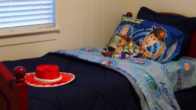
Right on trend, but it feels lifeless and cold.
My teacher showed us the 2012 color chart produced by CMG. It was a display of probably fifty different color chips, and yes, it was pretty spot-on for what I've been seeing available. For instance, this year, literally one-third of the chart was neutrals--shades of white, grey and beige. Many of the remaining colors were bright accent colors like turquoise and tangerine orange. Pay attention and you will see these colors (or lack of colors) all over Pinterest and your shopping cart. I am actually not particularly fond of the white on white on gray thing that is going on this year, but it is everywhere! I am just aching for someone to paint their walls something other than white! Oh well, I just need to bide my time, and it will all be different in a few months.

So, back to hot pink. Why is my favorite ninth grade T-shirt reappearing in store aisles this season? You might say that it's because the 80's are big again---it's retro! (Can I just say how disconcerting it is to see 80's clothes listed on EBay as "Vintage"?) And yes, that has something to do with it. But my teacher told us how the CMG makes its decisions, and he specifically used hot pink as an example. He said that hot pink is only popular when the economy is good. When people are doing better financially, they are more likely to be more daring in their color choice. Think of when hot pink has been popular in the last century. I immediately think of not only the 80's--when the economy was thriving--but also the 50's (think Marilyn Monroe in hot

pink), which were also a good time economically. So does the use of hot pink this season mean that retailers are forecasting economic prosperity, or that they are trying to inspire people to feel more economically daring? Hmmmm....that's something to think about, isn't it? (As a side note, my teacher also noted that hemlines go up in times of prosperity and down when times are hard. Been seeing a lot of maxi dresses lately? Well, if the hot pink is any indication, get ready for some shorter skirts in the next few months!)

Now, of course, these color predictions are not infallible. The CMGs predictions of popular color for Winter 2002 were exotic red-oranges and mineral blues and desert sand beiges, with a heavy middle-eastern influence. Unfortunately, nobody could have predicted 9/11, and all of a sudden nobody wanted anything to do with those sorts of colors. Instead, the sales of red, white, and blue products went through the roof. The purchasing public is very fickle, and often are influenced in ways that just can't be predicted.

My final thought on color trends is that while we will all be somewhat influenced by color trends, try not to let them rule your personal selections too much. It's okay to not like what is currently popular. Just because all the HGTV shows tell you that gray is the big new thing right now does not mean that you HAVE to do your home in gray (unless, of course, you really do like it, then it's fine). Try to explore your own tastes, figure out what you really do like, and personalize your home and your wardrobe so that it fits you to a T. Fashion icon Coco Chanel understood this concept. While she set the trends for so many others, she constantly emphasized the importance of being true to your own style: "Fashion fades, but style remains the same," is one of her famous quotes, but I always love this one: "In order to be irreplaceable, one must always be different."


Sunday, February 19, 2012

Designer-In-Training!

      Being blessed with a long Sunday afternoon with nothing to do for the first time in MONTHS, I thought I would resurrect ye olde blogge and give you all a little insight into what Interior Design school--you know, that thing that has been distracting me from blog writing for the past six months--is really all about. I've had a couple of people tell me that they are vicariously enjoying my educational experience with me, so I thought I'd bring you all into my world and let you know what it is that is taking up all my time.

      First, I would like to address the question of what an Interior Designer really does. This is the first thing they talk about in your "Introduction to Interior Design" class. Professional "Interior Decorators" began turning up around the end of the nineteenth century, mainly for upper class women who wanted someone with "good taste" to help them pick out their curtains and paint colors. They would see someone who had decorated their home nicely and ask them to help them with their own house, and through word of mouth, they were soon helping all their wealthy friends and neighbors pick out their drapes and wallpaper everything into oblivion. Eventually, people figured out that they could get paid for providing these services, and a new profession was born.

      Many people still use the terms Interior Decorator and Interior Designer interchangeably, but there really is a difference, and it is very important to our egos that you acknowledge it! "Decorator" suggests a focus on arranging the ornamental or movable aspects of a room, such as the paint color, furniture, textiles, accessories, etc.  The term "Designer" signifies a greater emphasis on planning, functionality, and effective use of space in addition to the decorative aspects. While being able to create beautiful color schemes and recognize quality furnishings is an important aspect of a designer's education, you are also expected to become well-versed in technical aspects of construction such as building codes and environmental issues,  know how to work with acoustics, lighting and electrical plans, be able to create artistic renderings or drawings of project plans, as well as be proficient in drafting floor plans by hand and with computer software for the use of contractors and for presentation purposes. A designer is also a salesman, and must learn the best methods and techniques to convey that concept to businesses and homeowners. While most people think of interior designers as working mainly with residential projects, there are also hundreds of opportunities for designers in working on everything from hotels and restaurants to hospitals and schools.

          In other words, there's a reason they require you to go to school for this stuff. It's a lot more than picking up the Pottery Barn catalog and telling your friend which sofa to buy. Most certified Interior Design programs are four-year bachelor's degrees. My program is a two-year Associate's Degree. (Of course, since I still have a preschooler at home, I am only taking two classes a semester, so it's going to take me a heck of a lot longer than two years to get it finished!) From the research I have done, LDS Business College is equal to other four-year programs in intensity and quality of education. They just eliminate a lot of the extra requirements that go along with a normal bachelor's degree (PE, social studies, etc). All of the required classes are directly focused on one thing: preparing you to get a job. While I enjoyed my time earning my Bachelor's degree in English at BYU, and wouldn't trade the education I got there for the world, I graduated after four years with very few real practical qualifications to enter the workforce. I could write a killer literary analysis of any given Edith Wharton novel, but let's face it, there just aren't a lot of jobs out there that require that particular skill. On the other hand, I know that when I graduate from LDSBC, I will have all the skills necessary to get a great job in design.

         One of the great perks at LDSBC is that all of the teachers are adjunct faculty, meaning that they are successful professionals in the business who teach a class or two on the side, so we get all the benefits of their years of experience in the industry. I had one teacher who was an architect for years, another who traveled all over the country designing the interiors of Macy's stores, and my current Color Theory teacher is an internationally acclaimed designer who has appeared in decorating magazines and done large projects all over the world, ranging from LDS temples to Five Star Resorts.

         So, now we've covered all that ground, allow me to give you a peek into what I actually have been doing in the program. As I said, I'm taking this kind of slow, so I am pretty much still stuck in what's considered the first semester of classes. The first two classes I took were "Introduction to Interior Design" and "Principles of Design." My Intro class was exactly that--they gave us an overview of what interior design is all about and what we would be studying in the program. We touched on the history of design, environmental/green issues in design, universal design (designing interiors that can be used by all people, regardless of age or physical ability), technical lighting issues, efficient space planning, the process of building a home, etc. A lot of these subjects will be classes that I will be required to take later on. We also did several group projects and some presentations in front of the class, which were graded on professional dress and speaking ability in addition to content.

        "Principles of Design" taught us about the fundamental aspects of good visual design. These are principles and elements that come to play in all visual images from art to architecture and can be manipulated to create different psychological effects. The elements include things like form, space, shape, line, color, texture, and some of the principles are harmony, scale, proportion, emphasis, balance, etc. We studied current and historical uses of these principles and elements in buildings, artwork, and, of course, interior design, and had to create a presentation showing and analyzing examples of each of them in those three different categories for our final project. We were also given the opportunity to put those principles into use as we designed a marketing poster for a festival, and designed and created our own home-made working light fixtures. This is my poster, but I didn't get a chance to take a picture of my lace chandelier before my kids smashed it.


  This semester, I am taking Color Theory and Drafting. Drafting is drawing floor plans by hand. Of course, most professionals use AutoCAD programs to draw up their floor plans now, but apparently it is necessary to know how to do it the old school way for some reason. Drafting is basically communicating ideas through drawing, either for presenting to the client, or to tell the construction people the details of what you want them to build. There's a lot of symbolism involved, and not in a literary way! You communicate certain concepts by how dark and thick the lines are that you draw, and you can't mix them up! For instance, you have to draw the walls of the floor plan in your darkest and heaviest pencil lead, then you have to switch to your medium pencil lead to draw the interior fixtures like sinks and cabinets. You have to list all the dimensions in a certain way, and if you have to make any written notes, you first have to draw guidelines with your lightest pencil lead and then write everything in all caps EXTREMELY neatly and consistently! As a person with very sloppy and inconsistent handwriting, I've found it quite challenging. After all this, you have to deal with all the mess and smudging that comes from drawing with soft pencil leads. Definitely makes me glad that we can do this on the computer in the future!

       Color Theory is probably my favorite class so far. For one thing, it's the first class that I have actually been able to start coming up with my own interior designs. We began by talking about the science and psychology of color--how our eyes perceive color, how light affects color, how color affects us physically and emotionally, what color conveys to us based upon our cultural experience, etc. Then we moved on to talk about different kinds of color schemes, such as achromatic, analagous, complementary, triad, etc, and the pros and cons of using them.  We mixed poster paints to learn how to achieve a variety of color effects, and our current project is to trace a piece of wallpaper and recreate the wallpaper pattern in paint as exactly as we can, using just the three primary colors plus black or white. We are then applying these concepts to interior design as we learn how to create an effective presentation, or "color" board, in which we display fabrics, wood or metal finishes, paint colors, etc to sell clients on our ideas. Our final project will be working with one of our teacher's actual clients and selling them on our design. I am learning a lot from this class and can see so many different ways to apply this kind of stuff!

       So, that's what I've got so far, and I know it was long, but it's really just the tip of the iceberg! I am still so excited to be able to get this education! It has been so fun for me. It is such a great mix of creativity and analytical thinking, a perfect balance of my right and left brain! I feel so lucky to be learning how to have a career in something that I love.


Tuesday, September 6, 2011

Back to Food: Two Chicken Recipes for the Price of One!


So, I know I've been doing the whole decorating thing lately, but I just need to share these delicious recipes with all y'all. One I got off of Allrecipes.com, with a few variations, but the other I just totally made up myself and it was sooo yummy! I'm back on Atkins induction this week--need to skinny up so I can impress all those little 18 year olds I'll be hanging out with!--so I'm focusing on the low carb meals again. These are both easy, fast, and delicious! And also, they can easily be prepared for one person or the whole family, and have only like five ingredients! Yay! See why I need to share? So here ya go! You can thank me later.

Red Pepper Stuffed Chicken Breast


1. Take frozen chicken breast(s) and defrost in microwave until they are about 75% thawed (i.e. still a little bit firm and cold). If they are the big thick kind, and you are feeding kids, you may want to cut them in half to make two portions.

2. Use a sharp knife to cut a little pocket into the thickest part of the breast. Be careful not to cut all the way through!

3. Stuff the the little pocket with equal amounts of crumbled feta cheese (I used the plain type, but I bet a flavored kind would be really tasty too!) and chopped roasted red peppers. You can either buy these in a jar (they're usually by the olives in the grocery store) or you can make them yourself.
   To make them yourself, cut several red peppers in half and remove all the seeds and membranes.  Place peppers cut side down on a cookie sheet or in a glass pan. Drizzle olive oil over the top of each pepper. Roast in a 450 degree oven for about 15-20 minutes, until peppers are soft and ever-so-slightly charred. These can be made ahead of time and refrigerated for a few days. 

4. Put some seasoned breadcrumbs in a flat dish (a cake or pie pan works well for this) and carefully coat the stuffed breast(s) with crumbs. (There is such a small amount of breading on this that I say the carbs are worth the extra flavor and texture).

5. Heat some olive oil and a pat of butter in a pan over medium-high heat, and brown each side of the chicken. Cover the pan and reduce the heat to med-low. Cook for an additional 5-10 minutes, depending on the size of the breast(s), to make sure it's cooked all the way through. You can also bake these in the oven if you'd prefer not to fry them.

6. In the meantime, in a blender, combine about 1/2 c. sour cream, 1 tsp. minced garlic (I often use the kind that comes pre-chopped in a jar), a few more red peppers, and salt and pepper to taste. Blend until smooth and spoon over cooked chicken. This dish is great with asparagus, green beans, or a salad!


Chicken Caprese

I say I made this up, but it is really just a variation on the popular Capri Salad. If you aren't familiar with it, Capri Salad is combination of fresh tomatoes, fresh basil, and fresh mozzarella cheese, usually with some sort of balsamic dressing. If you haven't had fresh mozzarella cheese, it is quite different than the kind we normally get. It is a lot softer, with almost a ricotta/cream cheese type consistency, and a very mild flavor. This combination of flavors shows up on everything from sandwiches and salads to pizza and pasta. Here is my quick version, which is not exactly like the picture, but close enough.

1. Preheat broiler.

2. Salt and pepper your thawed chicken breast(s). By the way, I only ever use freshly ground pepper--it is so worth it to buy a little grinder and use whole peppercorns. The flavorful oils that are released after grinding quickly dry out, so it is a much better taste than pre-ground pepper. Cook your chicken breast however you like--grill, saute, or broil--I usually grill when I'm in a hurry, but I think sauteing in olive oil gives it the best taste. When it is almost done, put a slice of mozzarella cheese on top (fresh is great if you've got it, but regular old mozzarella tastes just fine to me), and throw it under the broiler until melted and just a little bit bubbly and browned (about 3-5 minutes).

3. Chop up a tomato and some FRESH basil leaves. Try to get these from a friend or neighbor (or your husband's cousin) who has an herb garden, because they are ridiculously expensive at the grocery store. I usually lay a bunch of leaves flat on top of each other, then roll them up lengthwise, and then slice them into thin ribbons (That's called a "chiffonade". Thank you, Martha Stewart.). Throw the tomatoes and basil back into the pan you sauteed the chicken in, (or a new one) with a teensy bit more oil if needed, and saute them, stirring frequently, for just a minute or two until they are hot.

4. Top cooked chicken with tomato/basil mixture. Add a dash of balsamic vinegar on top, if desired, and there you go. YUM! I just threw this together and couldn't believe how flavorful it was! Enjoy!

Thursday, August 18, 2011

Salt Lake City Parade of Homes 2011: The Highlights!

I am a Parade of Homes junkie! I love going every year to ooh and ahhh over the big fancy houses, but also to get some real life ideas about what to do with a normal everyday house to make it special. It's a great way to see both design trends (the styles and techniques that you see over and over again) and design innovations (that one house that stands on its own, with a unique, but amazing style!). Here are my favorite highlights from this year's Parade. I will go into more detail on some of the individual houses in another post. And I apologize in advance--I am not a professional photographer and I don't have the awesomest camera!

Pretty Houses (outside)


Amazing Wallpaper


Really Cool Light Fixtures


Fun Kids' Rooms


Cool Outdoor Spaces


Pretty Bathrooms


Beautiful Bedrooms